Poster Design
Poster Design
Visual storytelling designed to convert attention into clicks.
CATEGORY:
Marketing Content
ROLE:
Creative Direction + Design
LOCATION:
Los Angeles
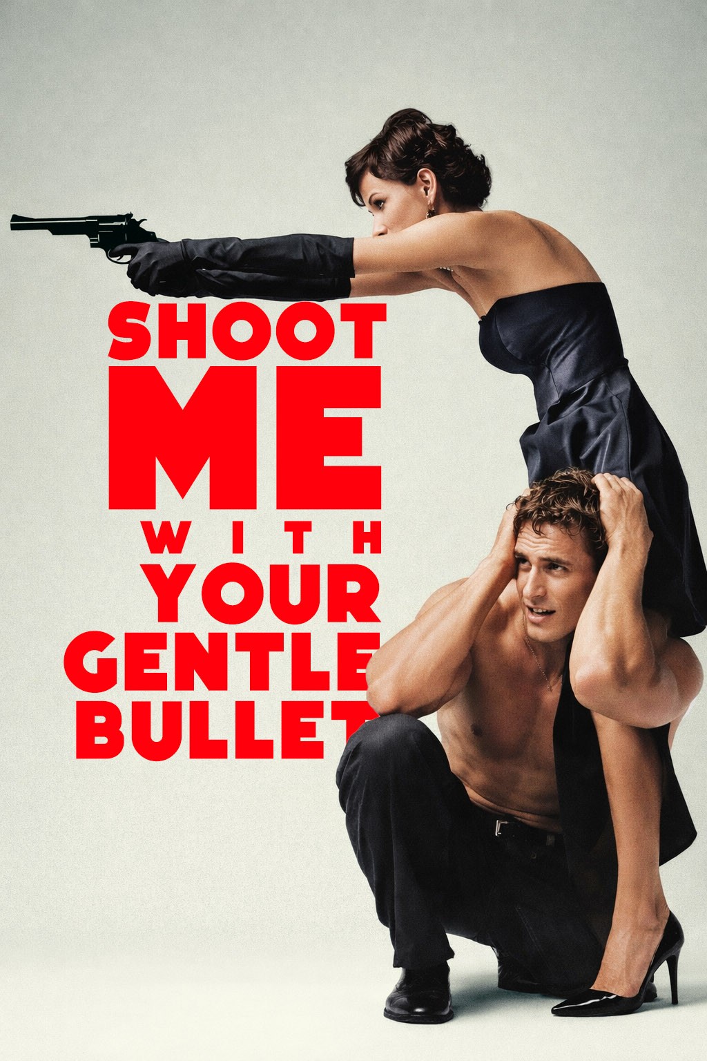
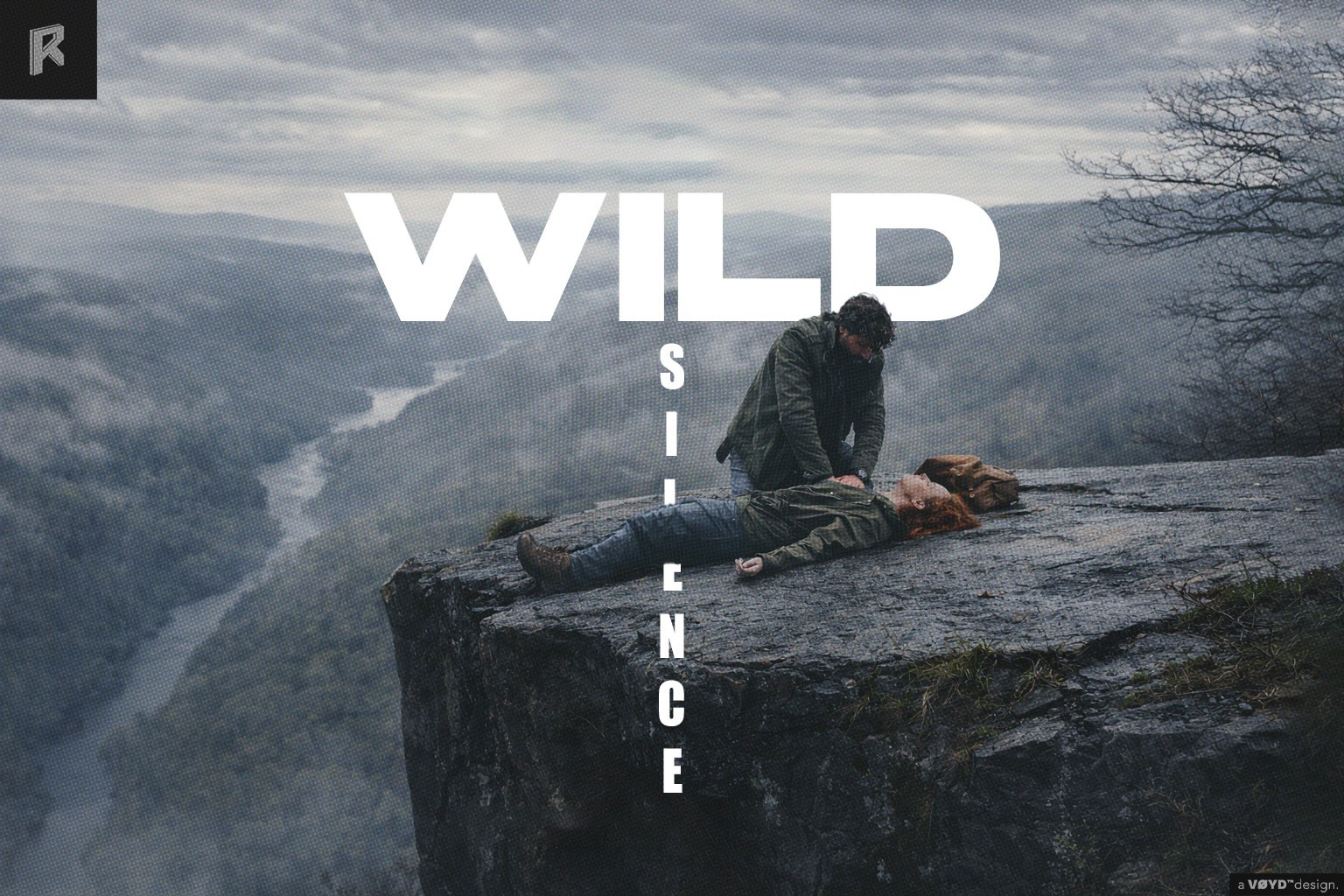
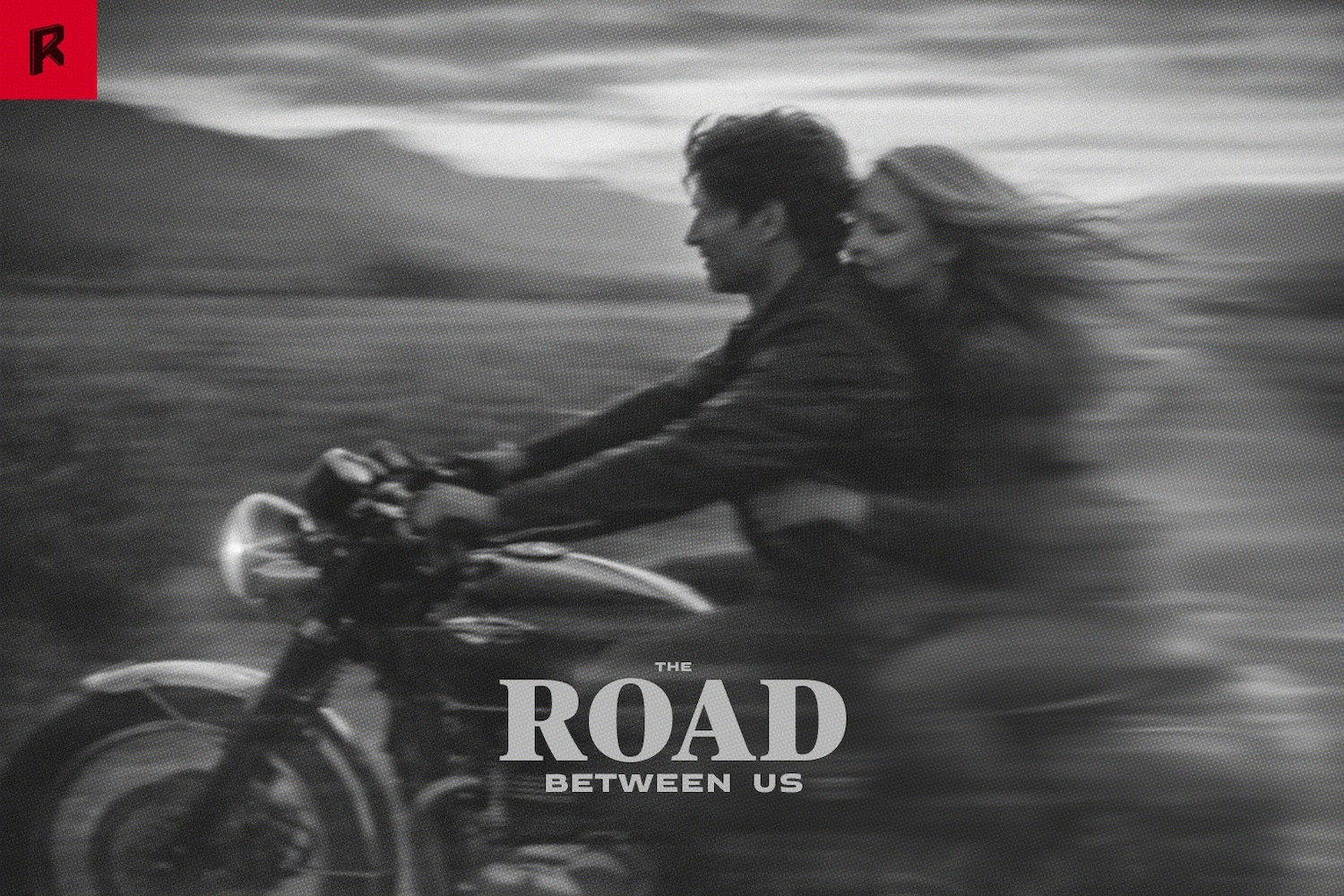
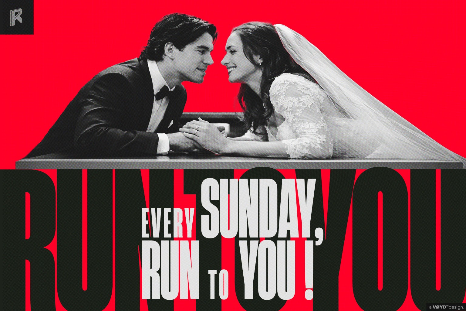
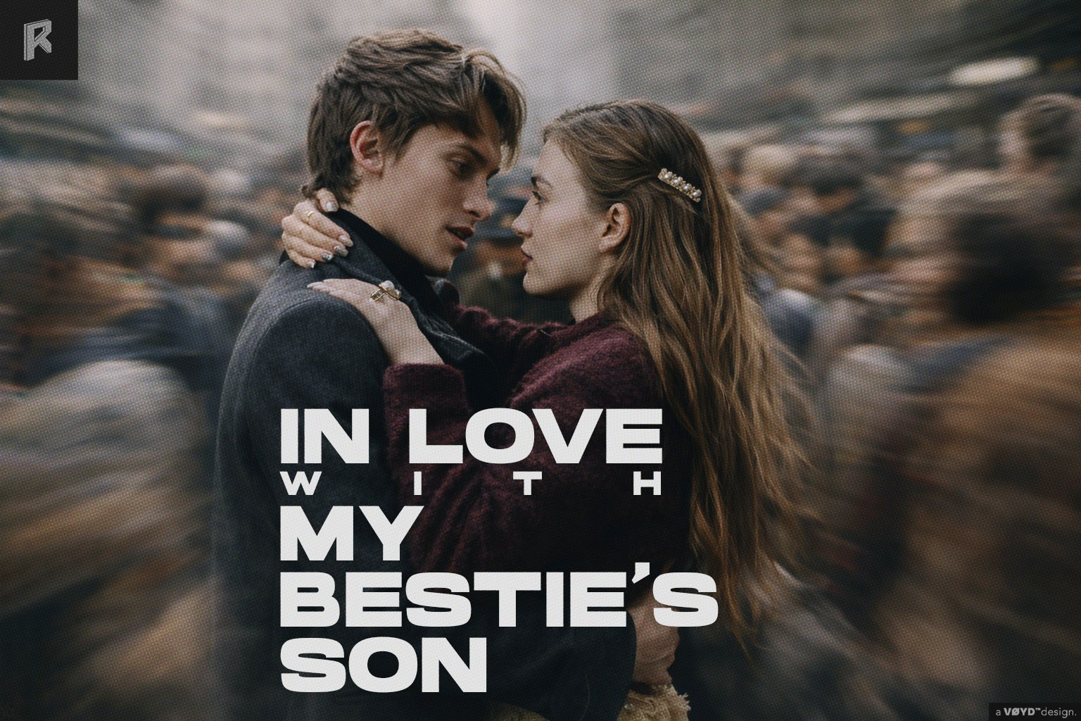
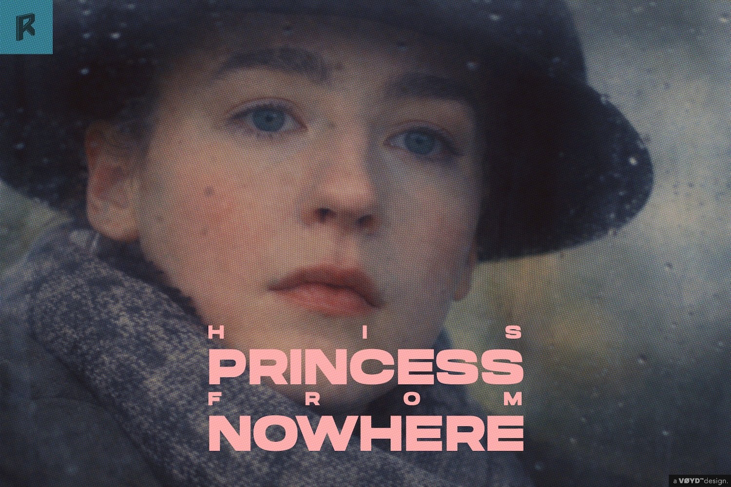
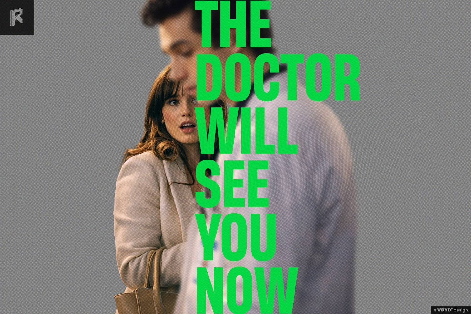
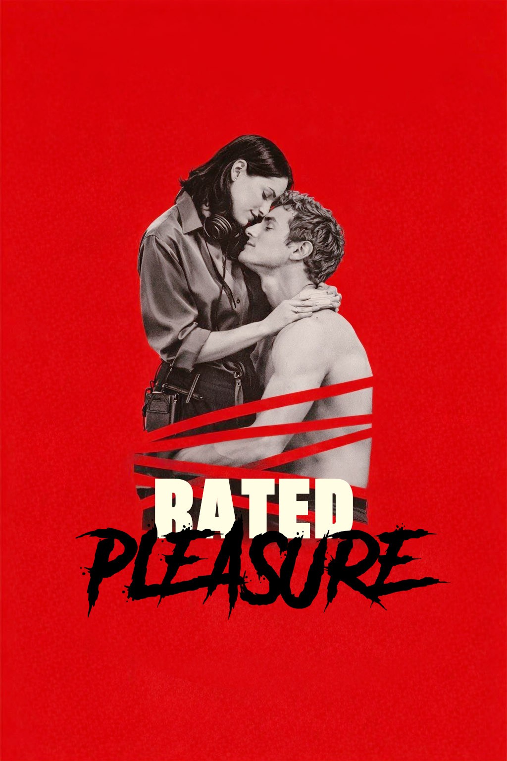
Poster design in vertical storytelling is not just about aesthetics, it’s about capturing attention within seconds and signaling tone, genre, and emotional stakes instantly.
We approach poster design as an extension of narrative development. Each visual is crafted with a clear understanding of platform behavior, audience psychology, and thumbnail performance across mobile environments. From character positioning to color language and typography, every element is designed to work within the fast-scrolling, high-competition ecosystem of vertical content.
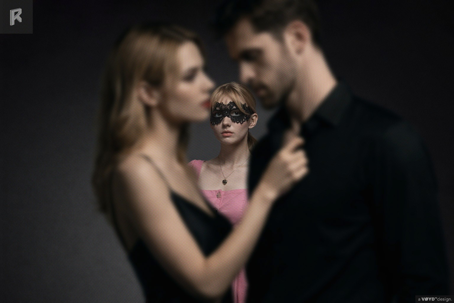
Our work spans original mini-series and branded collaborations, adapting visual strategies to different distribution contexts, whether it’s driving click-through on platform feeds or establishing a distinct identity for a project.
We develop posters alongside the content itself, ensuring consistency across story, marketing, and platform presentation. The result is not just a key art, but a functional entry point into the story, one that aligns creative intent with real audience behavior.
Gregory Lalle
Poster Design
Good design is not just about structure—it’s about the emotional weight of space, rhythm, and silence.
Visual storytelling designed to convert attention into clicks.
Category:
Marketing Content
Author:
Creative Direction + Design
Read:
Location:
Los Angeles
Date:
Understanding emotional response through space, hierarchy, and visual restraint:
Poster design in vertical storytelling is not just about aesthetics, it’s about capturing attention within seconds and signaling tone, genre, and emotional stakes instantly.
In digital design, space isn’t empty—it’s intentional. White space controls pacing, hierarchy builds comfort, and contrast guides attention. These elements evoke mood and build trust through unseen tension. A strong layout doesn’t just function—it speaks.
In well-crafted sites, layout becomes memory. You don’t just recall the content—you remember how it moved, how it felt, how it opened up space or leaned into density. That resonance is rarely about color or font alone—it’s how the structure carried everything with intention.
When every pixel plays its part, and every part respects the whole, we begin to build sites that don’t just function—they resonate. They linger. They become signatures. Not by shouting, but by speaking in rhythm, with quiet clarity and deep precision.
Explore deeper perspectives only on Akihiko Blogs.
We approach poster design as an extension of narrative development. Each visual is crafted with a clear understanding of platform behavior, audience psychology, and thumbnail performance across mobile environments. From character positioning to color language and typography, every element is designed to work within the fast-scrolling, high-competition ecosystem of vertical content.
Creating interaction that feels intuitive, considered, and emotionally aligned:
Our work spans original mini-series and branded collaborations, adapting visual strategies to different distribution contexts, whether it’s driving click-through on platform feeds or establishing a distinct identity for a project.
When motion, structure, and design align, users don’t think—they feel. That’s the sweet spot where layout becomes a bridge. Interfaces should communicate tone as much as task. Even the simplest detail—a button’s curve or a heading’s weight—can influence how someone feels.
Modular components give structure, but it’s the unexpected breaks—the asymmetry, the shift in rhythm, the quiet gesture—that introduce character. That’s where emotion sneaks in. That’s where the layout becomes a story, not just a scaffold. It’s in the relationship between repetition and surprise, clarity and contrast, that visual tension thrives.
We often think of layouts as fixed, but the best ones are elastic. They stretch to fit diverse narratives, but never lose coherence. They allow variation without losing voice. When a layout becomes too stiff, it feels soulless. When it becomes too loose, it loses trust. The sweet spot lies in the in-between. That edge—that living edge—is where the work breathes.
Know more about this through Akihiko Blogs.
We develop posters alongside the content itself, ensuring consistency across story, marketing, and platform presentation. The result is not just a key art, but a functional entry point into the story, one that aligns creative intent with real audience behavior.
Balancing order and creativity for expressive user interfaces:
They aren’t rigid templates or chaotic experiments—they’re frameworks that breathe, adapt, and respond. A layout, when designed with intent, doesn’t just hold content—it elevates it. It becomes the unseen rhythm of the page, guiding the user’s eye with balance, restraint, and just enough tension to keep things alive.
A smart layout doesn’t impose itself. It listens. It bends where it needs to. It adjusts for type, for image, for tone. It creates systems that can scale but still feel personal. A great layout doesn’t flatten expression—it preserves soul. It knows when to hold back and when to surprise. That balance is the mark of a thoughtful designer.
Find more insights on Akihiko Blogs.